I have been in the interior design industry for over 24 years. If you count the years as a child, constantly rearranging the furniture in my house, driving my mother crazy, you could say I have been in the industry for my whole life. Over the past two decades of helping clients navigate the jungle of building or rebuilding their home, I still feel joy when my client’s step into their new space. It is a beautiful feeling when I can help change the way people live. If your home functions well, you live better.
When starting any project one choice drives the others, a catalyst. I ask what is the environment that we are creating, and what inspired it?
It all comes down to attention to detail at the end of the day. Design really has no boundaries. If a client tells me they want as much blue as possible in their house, it is my job to decide where to place it without it being obnoxious. I mean, you cannot paint two opposite walls two different shades of blue and expect a pleasing aesthetic at the end of it all, right? Well, let’s take a look at one of my favorite projects, “The Violet”.

The differing texture of the walls and contrast of color make this color scheme work. These small changes can take your eye off of something that otherwise might not be pleasing. It really is the small details that tie a space together.
When I take on a new project, I like to understand how my clients live; what stage of life are they in? Are they single or married? Younger or older kids? Do they have pets? I also ask the emotion they want to feel when they enter their home. This is important as our homes should “serve us”
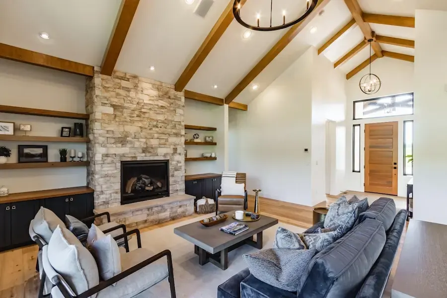
That takes me to a project I did for my clients who ended up like family, “Heavens Kitchen”
For this project my clients needed a kitchen fit for multiple cooks to work together. They wanted an island for gathering, an area for drinks to be mixed, multiple ovens and wine coolers, as they entertain frequently. Luckily, this client is a builder and was not afraid of taking risks. It was a good match.
To house all of the appliances needed we ended up having two islands. The countertops were a key factor as the cabinets were walnut and we needed something bright that also had a bit of personality. The countertops also needed to be low maintenance and hard wearing. Of course, granite was our go to. You can see that it flows beautifully, and the stone does not overwhelm the slab cabinets.
 Before picture, luckily it didn’t take much convincing to tear all of the walls down and start fresh

In their master bath. I went with a tonal palette of cool grays, whites, and creams. Then I added a punch of drama with the solid slab of emerald green quartzite in the shower. The end result was a luxurious spa-like haven that surely will not date itself.

Back to attention to detail, I have found the two most overlooked elements in most homes are paint color and lighting. They can drastically change the way a room feels. Color has a profound impact on our moods and emotions. Different colors evoke different feelings and reactions. They affect our physical and mental health, influencing everything from our energy levels to our appetite. Understanding how color affects us can help us create an environment that will boost physical and emotional health.
For instance, Red is bold and simulating. It increases appetite and can be associated with aggression and excitement. It can be a good color to sprinkle throughout a dining room or family room. Blue is calming, it can increase focus and stability. I used a blue color scheme for this client's home office in my project “Jug Mountain”

Yellow is energizing, it can very easily brighten your mood, but most of the time it's hideous in a home, let's not get carried away. A color that can always make a space feel alive is green. Green is soothing. It can be associated with harmony and balance. Representing growth and healing, which made it the perfect color grade for my project “Serenity”
 Exercise wouldn’t be such a chore if I had this room in my house.
For my Project “Marble Street” my clients were tired of the dark tones in their kitchen, and it quite frankly did not function well for them. The kitchen was disconnected from the family room. The space needed to be opened. Which required a large island that would serve as the hub for both the kitchen and living room. It also gave us an opportunity to use quartz for huge visual impact. Once the walls were taken down, they started to see the vision. They did not want too many elements in the room, so we decided against tile backsplash. The quartz material we selected from Francini is consistent, durable, low maintenance and still has “just enough” visual interest. So, we decided to go “all in” and have the sides waterfalled and put on the back of the island. The result? A dramatic beautiful kitchen.
 Before picture of “Marble Street”

Another detail that can easily be overlooked in a home is lighting. If we light everything, we really light nothing. Lighting should be layered. Having one fixture overhead in a room is not sufficient. Adding lamps and small accent lights add a comfortable inviting energy to any room. The temperature and brightness of the bulbs is also something to consider. It is remarkable what changing out a simple light bulb can do. By adjusting light and light temperature, we can influence our mood and emotions in a positive way.

Here in “Jug Mountain” we have multiple sources of light. The typical recessed lighting, two pendant lights, as well as accent lights on either side of the windows. The accent lights have a warmer bulb than the recessed lighting, adding a bit of depth to the room. Lighting will help you create different “moods”.
Tawnee's designs have been featured on Architectural Digest. She recently won the 2022 Regional Winner for the Thermador Kitchen Design Challenge
Tawnee Palmer
Tawnee Design