After a few years of vibrant colors animating the world of design, Pantone is getting back to basics with 2020's Color Of The Year (COTY), Classic Blue. According to Pantone "Instilling calm, confidence, and connection, this enduring blue hue highlights our desire for a dependable and stable foundation on which to build as we cross the threshold into a new era."
Who Is Pantone?
Pantone is the company that first standardized color in print applications. Before 1963 print colors were matched by eye. This lead to a huge variance. What Pantone did was distribute cards that had colors and the specific formula for making those colors regardless of where the inks were being mixed. This seems like a simple idea but it revolutionized not only printing, but fashion, design, and any application where color needed to be standard.
How Is The Color Of The Year Picked?
The Pantone Color Institute picks the COTY. While color theory, the science and art of using color, is important, The Institute seeks out how color is used in our lives. Traditional color industries such as graphic design and fashion are influential but a new color can surface from many different sources. They include travel destinations, new technologies, and even sporting events. The Institute understands that color is an important part of our everyday life and try to find the colors that express that.
The COTY is to reflect not just trends but a general attitude that sums up the year ahead. How did Pantone do? Here is the list of the past five year's COTY.
- 2019: Living Coral - a light orange-based hue intended for accents.
- 2018: Ultra Violet - a vibrant color thought to be mysterious and dramatic.
- 2017: Greenery - reflective of the yearning for a connection to nature.
- 2016: Rose Quartz and Serenity - the first year that two colors were chosen.
- 2015: Marsala - a versatile, earthy color.
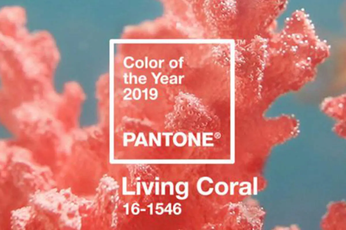 2019: Living Coral
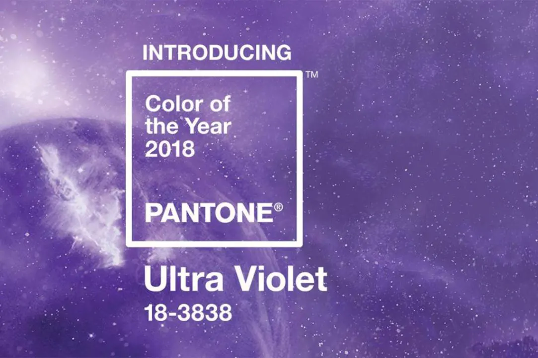 2018: Ultra Violet
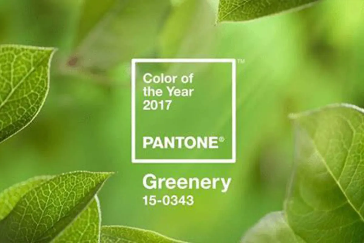 2017: Greenery
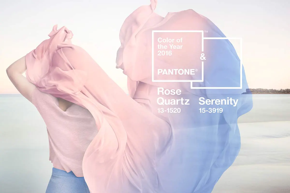 2016: Rose Quartz and Serenity
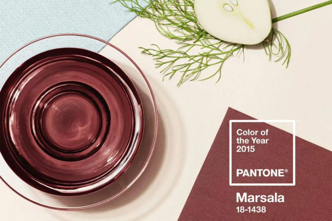 2015: Marsala
Classic Blue And You
The Color of the Year will be easy to incorporate since the color can express many things. Blue can make us think of water or skies. It can denote sultry music or an intangible such as trust. It will be found anywhere color is found such as print, fashion, and interior design.
Natural stone is a perfect complement to Pantone’s Classic Blue. For example, quartzite Blue Prime, when used as a countertop, can add a lovely touch of blue. Blue Bahia and Persa Blue granite, can match nicely with COTY. Alternately, a white, grey-veined marble in an interior, such as Statuario, provides a strong foundation for a Classic Blue wall. Whether you like to match colors or contrast them Francini's natural stone and Pantone’s Color of the Year come together to create stunning interiors.
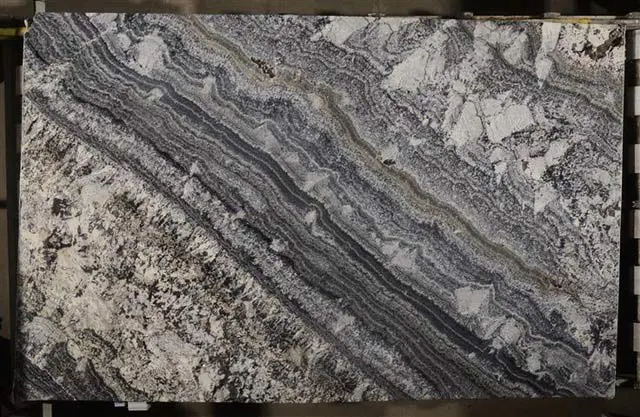 Blue Jean
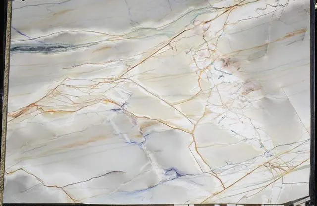 Blue Prime
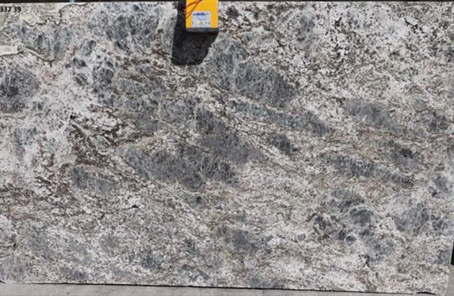 Azzurite
Contact Francini’s expert design team to set up an appointment and find out how COTY Classic Blue integrated with our collections can create the interior of your dreams. We’d be happy to tour you around our slab gallery and help you find the perfect accent stone.